Explore Plots
Cohort Results Plots
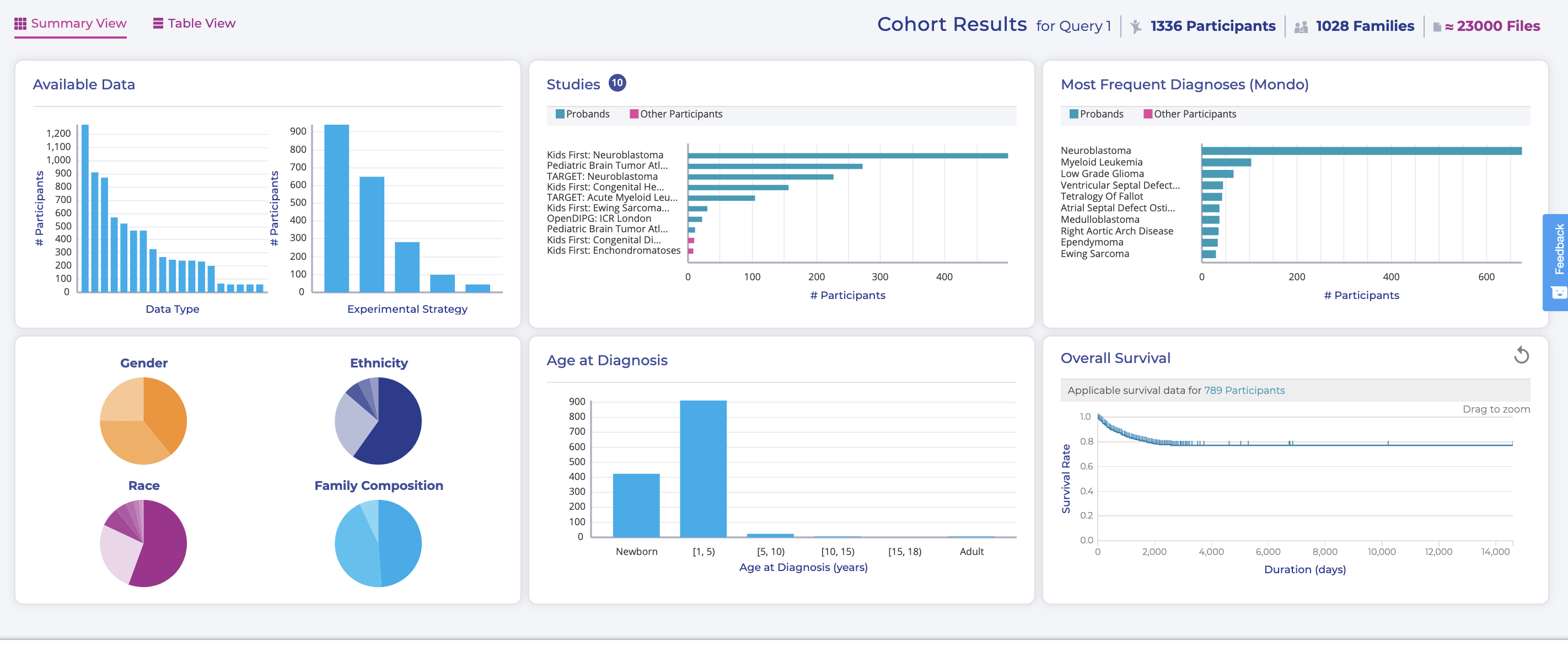
The other big change on this page is that all of the plots have dynamically updated, and this section has been renamed from "All data" to "Cohort Results for Query":

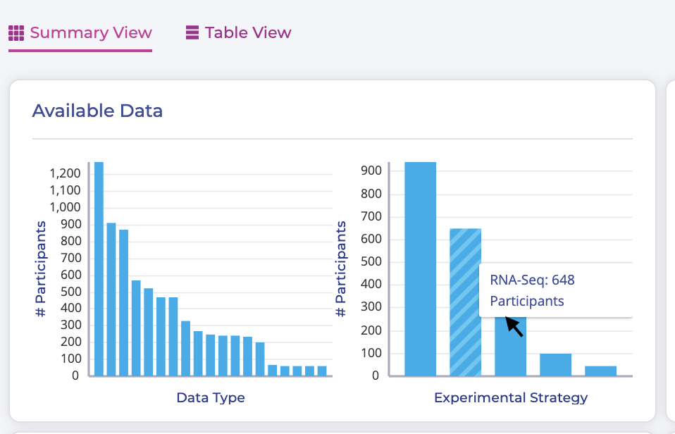
The most notable difference here, is that the distribution in the "Age at Diagnosis" plot in the center bottom has narrowed dramatically, which is expected given our query. All of the plots shown in this section respond dynamically to the query buttons, but they also can be used to build and refine queries, or to see extra information. For instance, if you hover your mouse pointer over a bar in the "Experimental Strategy" plot of the "Available Data" section, you'll get the count of that bar and its x-axis label:

You can continue to filter and refine your cohort by clicking on the bar in a chart or slices in a pie chart. Note that each time you make a selection in a plot, that filter is added to your query box above.
Exercise
Click a bar in the "Studies" plot to include only samples from the Kids First Neuroblastoma data set.
If you applied this filter successfully, you should see something like the following:

Note
We ran this query in early 2020. If you are doing this tutorial later, you may see more participants.