Visualize Data
ggplot()
ggplot2 is a very popular package for making visualizations. It is
built on the “grammar of graphics”. Any plot can be expressed from the
same set of components: a data set, a coordinate system, and a set of
“geoms” or the visual representation of data points such as points,
bars, lines, or boxes. This is the template we build on:
ggplot(data = <DATA>, aes(<MAPPINGS>)) +
  <geom_function>() +
geom_bar()
We just used the count() function to calculate how many samples are in
each group. The function for creating bar graphs geom_bar() also
makes use of stat = "count" to plot the total number of observations
per variable. Let’s use ggplot2 to create a visual representation of how
many samples there are per tissue, sex, and hardiness.
# Visualizing data with ggplot2
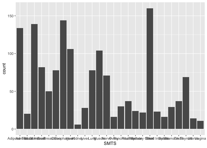
ggplot(samples, aes(x = SMTS)) +
geom_bar(stat = "count")
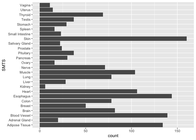
In the last section, we will discuss how to modify the themes() to
adjust the axes, legends, and more. For now, let’s flip the x and y
coordinates so that we can read the sample names. We do this by adding a
layer and the function coord_flip()
ggplot(samples, aes(x = SMTS)) +
  geom_bar(stat = "count") +
  coord_flip()
Now, there are two ways we can visualize another variable in addition to tissue. We can add color or we can add facets.
Let’s first color the data by age bracket. Color is an aesthetic, so it
must go inside the aes(). If you include aes(color = AGE) inside
ggplot(), the color will be applied to every layer in your plot. If
you add aes(color = AGE) inside geom_bar(), it will only be applied
to that layer (which is important later when you layer multiple geoms).
head(samples)
ggplot(samples, aes(x = SMTS, color = AGE)) +
geom_bar(stat = "count") +
coord_flip()
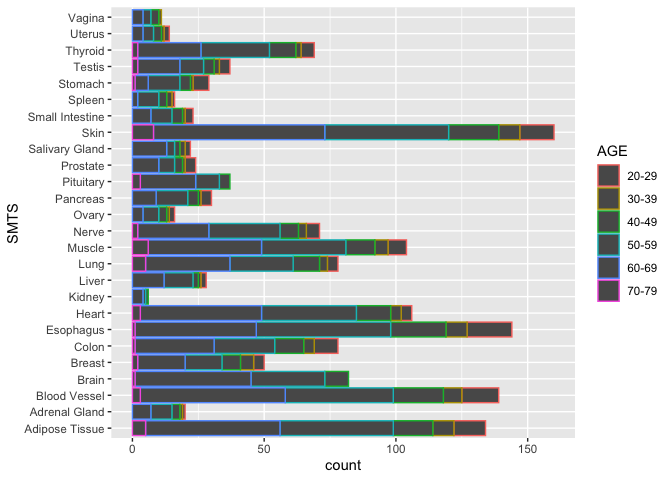
Note that the bars are outlined in a color according to Hardy scale. If
instead, you would the bars “filled” with color, use the aesthetic
aes(fill = AGE)
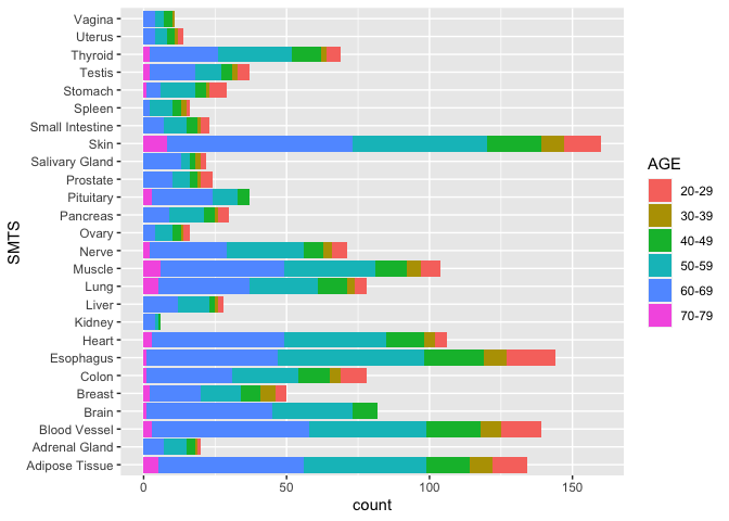
ggplot(samples, aes(x = SMTS, fill = AGE)) +
geom_bar(stat = "count") +
coord_flip()
Now, let’s use facet_wrap(~SEX) to break the data into two groups
based on the variable sex.
ggplot(samples, aes(x = SMTS, fill = AGE)) +
  geom_bar(stat = "count") +
  coord_flip() +
  facet_wrap(~SEX)
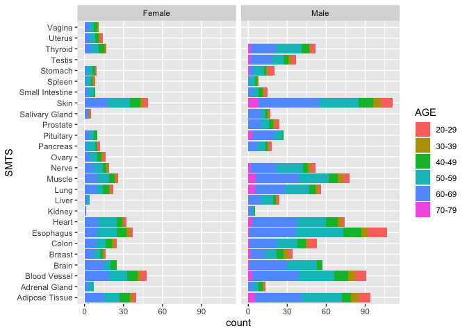
With this graph, we have an excellent overview of the total numbers of RNA-Seq samples in the GTEx project, and we can see where we are missing data (for good biological reasons). However, this plot does not show us Hardy Scale. It’s hard to layer 4 variables, so let’s remove Tissue as a variable by focusing just on one Tissue.
Exercise
Create a plot showing the total number of samples per Sex, Age Bracket, and Hardy Scale for just the Heart samples. Paste the code you used in the chat.
There are many options. Here are a few.
```r ggplot(samples, aes(x = DTHHRDY, fill = AGE)) + geom_bar(stat = "count") + facet_wrap(~SEX)
ggplot(samples, aes(x = AGE, fill = as.factor(DTHHRDY))) + geom_bar(stat = "count") + facet_wrap(~SEX) ```
One thing these plots show us is that we don’t have enough samples to test the effects of all our experimental variables (age, sex, tissue, and hardy scale) and their interactions on gene expression. We can, however, focus on one or two variables or groups at a time.
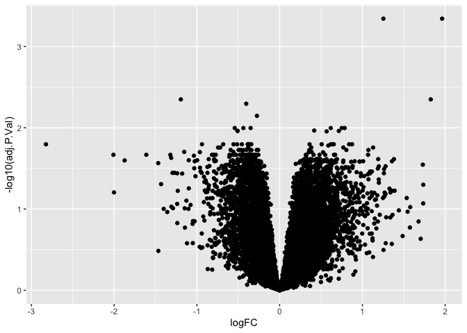
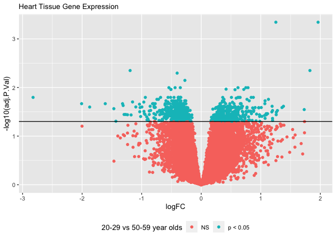
Earlier, we imported the file “data/GTEx_Heart_20-29_vs_50-59.tsv” and saved it as “results”. This file contains the results of a differential gene expression analysis comparing heart tissue from 20-29 to heart tissue from 50-59 year olds. This is a one-way design investigating only the effect of age (but not sex or hardy scale) on gene expression in the heart. Let’s visualize these results.
geom_point()
Volcano Plots
are a type of scatter plots that show the log fold change (logFC) on the
x axis and the inverse log -log10() of a p-value that has been
corrected for multiple hypothesis testing (adj.P.Val). Let’s create a
Volcano Plot using the gplot() and geom_point(). Note: this may
take a minute because there are 15,000 points that must be plotted
ggplot(results, aes(x = logFC, y = -log10(adj.P.Val))) +
  geom_point()
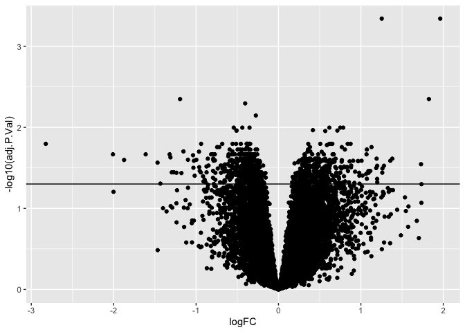
The inverse log of p < 0.05 is 1.30103. We can add a horizontal line to
our plot using geom_hline() so that we can visually see how many genes
or points are significant and how many are not.
ggplot(results, aes(x = logFC, y = -log10(adj.P.Val))) +
  geom_point() +
  geom_hline(yintercept = -log10(0.05))
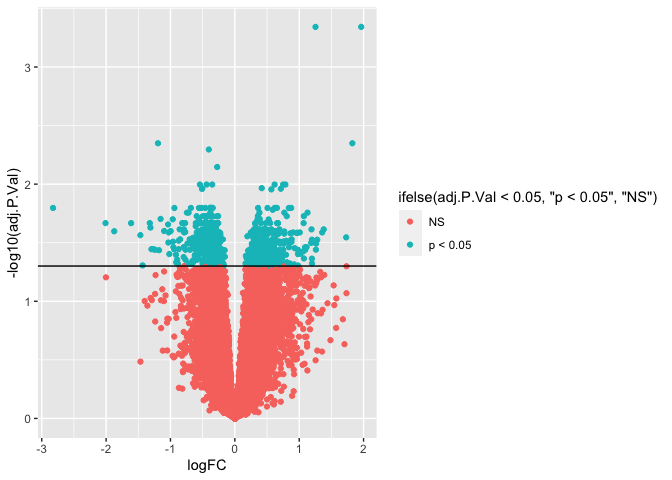
We can add color to a plot by specifying the color and/or fill. If we wanted to color all the points blue, we could do this by specifying aes(color = "blue"). Alternatively, we could color points along a gradient by specifying aes(color = adj.P.Val).
I find it useful to color the points by whether or not the genes are significant. We can do this by adding an if else statement: aes(color = ifelse( adj.P.Val < 0.05, "p < 0.05", "NS")). This essentially create two factors called "p < 0.05" and "NS" and gives each factor a color different color on the plot.
ggplot(results, aes(x = logFC, y = -log10(adj.P.Val))) +
  geom_point(aes(color = ifelse( adj.P.Val < 0.05, "p < 0.05", "NS"))) +
  geom_hline(yintercept = -log10(0.05))
To clean up the plot, we can move the legend to the bottom with theme(legend.position = "bottom").
Then, we can add titles, subtitles and captions and rename axes and legends with labs().
ggplot(results, aes(x = logFC, y = -log10(adj.P.Val))) +
  geom_point(aes(color = ifelse( adj.P.Val < 0.05, "p < 0.05", "NS"))) +
  geom_hline(yintercept = -log10(0.05))  +
  theme(legend.position = "bottom") +
  labs(color = "20-29 vs 50-59 year olds",
       subtitle = "Heart Tissue Gene Expression")
We have only scratched the surface of plotting, but these basics will get you started. Try to craete a plot on your own.
Exercise
Create a volcano plot for the results comparing the muscle* tissue of 20-29 year olds to that of 50-59 year olds? Are more or less differentially expressed gene between between this age group in the heart or muscle?
df <- read.table("./data/GTEx_Muscle_20-29_vs_50-59.tsv")

ggplot(df, aes(x = logFC, y = -log10(adj.P.Val))) +
  geom_point() +
  geom_hline(yintercept = -log10(0.05))
geom_boxplot()
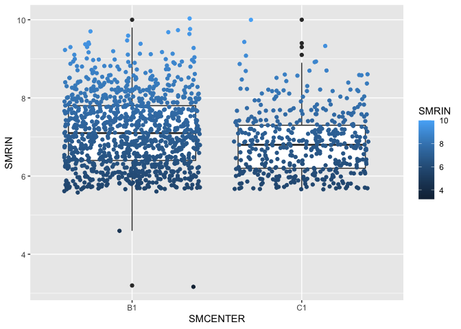
In addition to containing information about the donor tissue, the samples file contains has a column with a RIN score, which tells us about the quality of the data. If we wanted to look for interactions between RIN score (SMRIN) and sequencing facility (SMCENTER), we can use a box plot.
ggplot(samples, aes(x = SMCENTER, y = SMRIN)) +
  geom_boxplot() +
  geom_jitter(aes(color = SMRIN))
Now you know a handful of R functions for importing, summarizing, and visualizing data. In the next section, we will tidy and transform our data so that we can make even better summaries and figures. In the last section, you will learn ggplot function for making fancier figures.
Key functions
| Function | Description |
|---|---|
ggplot2 |
An open-source data visualization package for the statistical programming language R |
ggplot() |
The function used to construct the initial plot object, and is almost always followed by + to add component to the plot |
aes() |
Aesthetic mappings that describe how variables in the data are mapped to visual properties (aesthetics) of geoms |
geom_point() |
A function used to create scatter plots |
geom_bar() |
A function used to create bar plots |
coord_flip() |
Flips the x and y axis |
geom_hline() |
Add a horizontal line to plots |